Data Analysis & Visualization with Streamlit
What is Streamlit and why do we need it?
In today’s post, I would like to introduce one of my favorite Python libraries, Streamlit, a Python data web application framework.
When first learning Python data analysis, most people start with Jupyter Notebook, as we usually want to see the intermediate results and graphs of data. And this workflow goes very well with the cell-wise execution environment of Jupyter Notebook, compared to pure Python files(.py).
I have also started with Jupyter notebook, and still use it quite a lot when I do EDA (Exploratory Data Analysis), simple data preprocessing and modeling.
However, when it comes to sharing the analysis results or graphs with others, especially in environments where Python is not available or a web UI is required, Jupyter notebooks are simply not enough.
It takes time to learn frontend and backend from ground-up, and even if you do so, bridging Python data wrangling code with JavaScript backend code is not a simple task. All you wanted to do was read a bunch of csv files, do some data wrangling and plot them, but now the tail is wagging the dog.
Then comes the savior - Streamlit.
Streamlit is an open-source Python library which provides clean Web UI widgets for pure python data code. The greatest advantage of streamlit is that no frontend knowledge is required whatsoever.
As streamlit itself is a Python library, it can be pip installed just like pandas or numpy.
1
pip install streamlit
In today’s post, I will share the whole cycle of building a streamlit project from scratch. The full cycle - data preprocessing and visualization with open data, constructing a data web page, and deploying the app to the public web.
Also, as we go we will take a look at the intermediate steps and thought process of the code, as well as the overall result. I hope that everyone can learn something from this post, not simply streamlit.
All the code in this post is accessible in my GitHub repository. Feel free to check it out!
Local Environment
- macOS Sonoma 14.2.1
- OSX arm64 (Apple Silicon)
- zshell
- This tutorial is effective as of March 2024
Data Analysis Scenario
As streamlit is a data web app framework, for this example we need a virtual data analysis scenario. For this publicly open tutorial, we need publicly open data - I will go with Seoul bike rental data.
Especially, I would suppose that I would like to analyze and visualize the daily/monthly usage trend of the bike rental service. For this I would need:
I have downloaded the data and put it inside a folder named raw_data/.
We will use this data to visualize daily/monthly bike rental usage trends, and deploy the app.
Data preprocessing
As with any data in the world, raw data requires some kind of preprocessing. This data was relatively clean, but required the following preprocessing transformations:
- Rename Korean column names to English column names, as sometimes Korean fonts are broken in some plots.
- Format and split the different format timestamp columns(ymd or ym) as year, month, and day columns.
- Group the preprocessed DataFrames into year, month and save as parquet files.
The following code is an extract of the code that processes daily usage raw data into daily_usage_data.
1
2
3
4
5
6
7
8
9
10
11
12
13
14
15
16
17
18
19
20
21
22
23
24
25
26
from seoul_bike_streamlit.paths import (
    COLUMN_MAPPER_PATH,
    DAILY_DATA_USAGE_PATH,
    DAILY_RAW_DATA_PATH,
)

# ... omitted

DATA_NAME = "daily_usage"
logger.info("Cleaning data for %s...", DATA_NAME)
rename_mapper = load_yaml(COLUMN_MAPPER_PATH / f"{DATA_NAME}.yaml")
logger.debug("raw data path: %s", DAILY_RAW_DATA_PATH)
for csv_path in DAILY_RAW_DATA_PATH.rglob("*.csv"):
    logger.info("Reading raw data %s", csv_path.name)
    df = pd.read_csv(csv_path, encoding="cp949")
    df = (
        df.pipe(rename_cols, columns=rename_mapper)
        .pipe(split_timestamp_ymd)
    )
    logger.debug("df.columns after cleaning: %s", list(df.columns))
    logger.info("Data cleaning successful for data %s", csv_path.name)
    for group, df in df.groupby(["year", "month"]):
        logger.info("Saving cleaned data for group: %s", group)
        year, month = group
        df = df.reset_index(drop=True)
        df.to_parquet(DAILY_DATA_USAGE_PATH / f"{year}_{str(month).zfill(2)}.parq")
Here are some notes.
- I have used
logginglibrary’sloggerinstead of the commonly usedprintfunction. This is considered better programming practice than adding and commenting out bunch ofprintstatements in development. A deeper reason and logic is off the scope of this post. For those who are curious please check out this post. Path related variables such as
COLUMN_MAPPER_PATH,DAILY_RAW_DATA_PATH,DAILY_DATA_USAGE_PATHare imported instead of declared inside the main code. This is to follow the DRY(Don’t Repeat Yourself) principle. Also note that paths are notstrtyped, but of typepathlib.Path. Why this is preferred is also out of the scope for this article, so I’ll address another post on this subject. But one advantage we can see here is thatpathlib.Pathcan pick up all files with a specific extension with something likepath.rglob("*.csv").- The column name mappers (Python dictionaries) used for
df.renameis not declared in the code, but read from a separate yaml config file. This is to observe the DRY principle, and to decouple the configuration from the actual code for maintainability.
1
2
3
4
5
6
7
8
9
10
11
12
# keys are renames to the values
대여일자: timestamp
대여소번호: rent_station_code
대여소: rent_station_name
대여구분코드: rent_type
성별: gender
연령대: age
' 이용건수': rent_count # preceding space is intentional
운동량: exercise_amount
탄소량: carbon_emission
이동거리(M): rent_meter
이용시간(분): rent_minute
- Not so popular but a useful function I would like to introude is the
df.pipefunction. When working with pandas doing some operation ondfand assigning the result back todf, likedf = df.some_func(...)is a very common use case.df.pipesupports this exact behavior, and with this you can make your pandas wrangling code more modular and reusable. - Another note I would like to point out is using
df.groupbyas an iterator. Withfor group, df in df.groupby(["year", "month"]):, we can usedf.groupbyas an iterator to loop through the individual groups and their corresponding DataFrames to perform group-wise operations.
We have preprocessed the raw daily usage data and saved to daily_usage_data.
Likewise, we can preprocess the raw monthly usage data and save to monthly_usage_data.
However, this is not enough as daily_usage_data and monthly_usage_data is too big to hand over to streamlit.
All we want is the usage count data, especially the cumulative count of all daily or monthly users, not user-wise usage count.
Thus we need a daily_usage_data -> aggregate_daily_usage aggregation preprocessing. The code is accessible here, but I will skip the explanation as it is similar to the above code.
Data Visualization
Now that we have preprocessed the data, we can move on to the visualization. There are many Python visualization libraries, but we need to use the ones supported by streamlit API to integrate the plot easily onto the streamlit UI.
I will choose plotly for this example.
1
2
3
4
5
6
7
8
9
10
11
12
import plotly.express as px
import streamlit as st
# ... omitted
agg_daily_trend_df = agg_daily_trend_df.query("timestamp>=@start_date and timestamp<@end_date")
enable_ols = st.toggle("Show trend line", value=True, key="daily_trend_toggle")
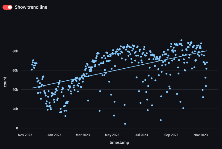
px_chart = px.scatter(agg_daily_trend_df,
x="timestamp",
y="count",
trendline="ols" if enable_ols else None)
st.plotly_chart(px_chart)
- The above code queries a DataFrame named
agg_daily_trend_df, plots it with plotly express scatter plot(px.scatter), and puts it to the streamlit UI. - Another take-away is the
df.query()function. For columnar queryingdf.query()is advantageous versus the commonly useddf.loc[], so I recommend you to check out the df.query doc and add it to your repertoire. st.togglerenders a toggle switch to the UI to conditionally control some component based on user input. Here it is used as a switch to toggle the OLS trend line to the scatter plot. Note that thetrendlineoption is a plotly option, not streamlit.- If you are used to plotly express(
px) or plotly.graph_objects(go), all you need to do to put your plot to streamlit UI is this single line:st.ploty_chart()
As a result we can render this interactive graph to the web UI.
Note that plotly’s zoom in/out, pan, hover, export to PNG functionality is fully supported in the web UI. You can also interactively turn on/off the trendline for the usage trend with st.toggle’s toggle button.
Streamlit Page Construction
In the “Data Visualization” section we have looked at how st.ploty_chart() can render a interactive graph to the UI.
Here we will look at other web components and widgets to construct the streamlit web UI.
Here is the code to construct the above UI.
1
2
3
4
5
6
7
8
9
10
11
12
13
14
15
16
17
18
import datetime
import streamlit as st
# ... omitted
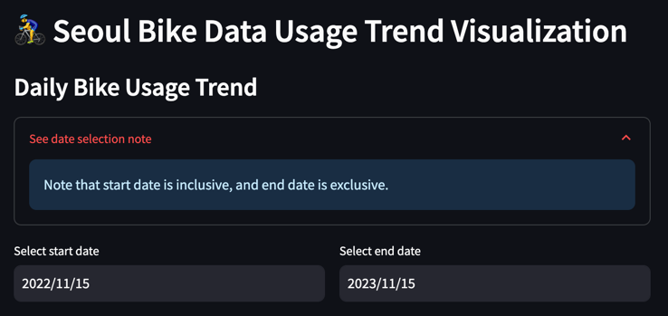
st.header("🚴♂ Seoul Bike Data Usage Trend Visualization")
st.write("### Daily Bike Usage Trend")
with st.expander("See date selection note"):
st.info("Note that start date is inclusive, and end date is exclusive.")
col1, col2 = st.columns([1, 1])
with col1:
start_date = st.date_input("Select start date",
datetime.date(2022, 11, 15),
key="daily_trend_start")
with col2:
end_date = st.date_input("Select end date",
datetime.date(2023, 11, 15),
key="daily_trend_end")
Pretty simple, right? With self-explanatory widgets like st.header(), st.write(), st.expander(), st.info(), st.columns(), st.date_input() we can easily implement interactive UI widgets. Espeically widgets like date input is tricky if you were to implement it from scratch, but streamlit provides clean and reliable APIs.
Note that when we modify the start and end dates for data querying with the date input widget, the graph is interactively rendered again with the new data.
The functions introduced in this post is only a very small fraction of all the widgets that the Streamlit API provides. To see the full list, please refer to the Streamlit official doc.
By default, streamlit runs the full page top to bottom if there is any change in the user input. This means that time-consuming operations like data IO or data operations are run again and again several times for the same output. To mitigate this inefficiency, streamlit has its own caching methods. To fully integrate streamlit into your project, this is an absolute requirement, For brevity purposes I cannot address this in this post, but I stronly advise you to refer to streamlit’s doc on caching for actual, real-world usage.
As streamlit is a Python library, the user can develop everything in pure Python.
With everything including the streamlit API code as a Python file named 🚴_Seoul_Bike_Usage_Trend.py, we can spin up the app with:
1
streamlit run 'seoul_bike_streamlit/streamlit/🚴_Seoul_Bike_Usage_Trend.py'
Streamlit also supports multi-page apps. Like the below directory structure, put all the multi-page Python files in a folder named pages in the same level as the home page(entrypoint file) Python file.
1
2
3
4
├── 🚴_Seoul_Bike_Usage_Trend.py
├── pages/
│ ├── 🇰🇷_What_is_Seoul_Bike.py
│ └── ...
Note that there are emojis (🚴, 🇰🇷) in the file names. This is used for the emojis in the sidebar when multiple pages are rendered. In the UI it looks something like this.
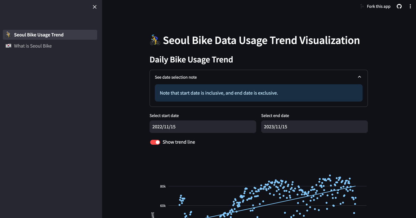
With the streamlit run, the home page is rendered at localhost:8501 (8501 is the default port number which can be configured), and the hot-reload functionality is supported by streamlit, making the development and debugging smoother in the local environment.
Integrating 3rd party APIs
Even if streamlit or plotly does not have the API that matches your needs, there are many smart people out there who had the same thought.
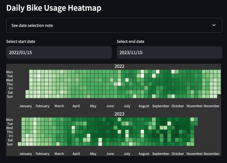
Here I already visualized the daily usage with a scatter plot, but I also wanted to visualize the daily usage as a heatmap on a calender, which does not exist in plotly or streamlit. Then I found this Python library named plotly-calplot.
This library’s calplot provides GitHub Contribution Activity style calendar heatmaps, which was what I was looking for. (Big kudos to the creators of this library.)
This library is pip installable, and compatible with the plotly API.
1
2
3
4
5
6
7
8
9
10
11
12
13
14
15
import streamlit as st
from plotly_calplot import calplot

# ... omitted

agg_daily_heatmap_df = agg_daily_heatmap_df.query("timestamp>=@start_date and timestamp<@end_date")
daily_usage_cal_plot = calplot(agg_daily_heatmap_df,
                               x="timestamp",
                               y="count",
                               dark_theme=True,
                               space_between_plots=0.25,
                               month_lines=False,
                               years_title=True,
                               )
st.plotly_chart(daily_usage_cal_plot)
Deployment
Now that we are done with local development, now it is time to deploy the wonderful app to the whole wide world.
Deployment is always a tricky process with trial-and-error, but deploying streamlit apps was very simple, everything packaged and configured with a few clicks.
Streamlit’s super-simple deployment service is only available when your repo is a public repository, and on the condition that everyone in the Streamlit community can share what you made. In Streamlit they call this “Streamlit Community Cloud” deployment. I you are working in a private repo or in a corporate environment, you would need to do a custom deployment. But even with this the entrypoint command for streamlit is the same as development (
streamlit run) so it is not so tricky to write the Dockerfile. For more information on Custom deployment, please refer to streamlit’s doc on custom deployment.
First you would need to commit and push your code to a public GitHub repository, and in your local environment, click on the “Deploy” button on the top-right corner.
Selct “Streamlit Community Cloud” from the deploy options (beware as noted in the above callout this will would mean your code is accessible by the public) and select the target GitHub repo, target branch, main entrypoint file(in this case 🚴_Seoul_Bike_Usage_Trend.py), and the app url. This App url refers to the final URL that your deployed app will have, so pick a name that is not taken already and represents your app clearly.
In the “Advanced setting” you can set the Python version (I would recommend to match this to your local Python version), and the environmental variables you need in the app.
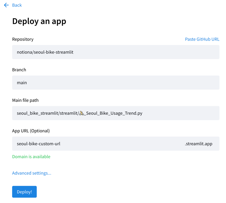
Now if you hit the “Deploy!” button, your app is in the oven with streamlit’s cute UI. When deployment is complete you can access your app with your preferred browser, with the app url you have configured.
Up to this point, today we have gone through the whole streamlit data project - public data acquisition, data preprocessing, data visualization, streamlit page construction, and deployment.
If you would like to follow the whole process on your own, feel free to fork my repo and follow through.
Equivalent Korean Post
Streamlit을 사용한 공공데이터 전처리 & 시각화
References
- https://stackoverflow.com/questions/6918493/in-python-why-use-logging-instead-of-print
- https://docs.streamlit.io/library/api-reference/
- https://pandas.pydata.org/docs/reference/api/pandas.DataFrame.query.html
- https://github.com/brunorosilva/plotly-calplot
- https://docs.streamlit.io/knowledge-base/tutorials/deploy
Please feel free to point out any inaccurate or insufficient information. Also, please feel free to leave any questions or suggestions in the comments. 🙇♂️